Photo credit: Tyler Walsh / Economic Development Winnipeg
Peg is a data dashboard – also known as a community indicator system – tracking measures called “indicators” that reflect our city’s well-being. In measuring the well-being of our city year-over-year, Peg helps Winnipeggers learn how their life, their neighbourhoods and their city is changing.
The Peg team updates the indicators as new data becomes available. We’ve provided a round-up of the latest data updates to our community indicators below, with many giving a sense of how Winnipeg was faring as it entered the pandemic.
How We Bring you Local, Reliable Data
Peg is your hub for reliable data from sources including the City of Winnipeg, Stats Canada, Manitoba Centre for Health Policy and more. The International Institute of Sustainable Development (IISD)—who, with United Way Winnipeg, leads Peg—vets all data prior to information being available on the Peg site. This adds another layer of assurance to the quality of the data—the data comes from credible sources and IISD confirms the validity of the content on Peg.
You can find a range of information in eight community indicator theme areas: Built Environment, Basic Needs, Economy, Education & Learning, Health, Natural Environment, Social Vitality & Governance and Demographics. Each theme area provides graphs and descriptions on relevant indicators to help non-profits and other organizations identify trends in our city’s well-being.
Newly Updated Indicators
We have compiled the most recent data available for over 20 community indicators:
Built Environment
- Building Permit Values (2019 data)
- Collision Fatalities (2019 data)
- Dwelling Density (2016 data)
- Housing Starts (2019 data)
- Transit Trips Per Capita (2019 data)
Basic Needs
- Personal Safety (2019 data)
Economy
- Building Permit Values (2019 data)
- GDP (2019 data)
- Housing Starts (2019 data)
- Retail Sales (2019 data)
- Youth Unemployment Rate (2019 data)
Health
- Diabetes Rates (2016/17 data)
- Heart Attacks (2012-2016 data)
- Obesity Rates (2017/18 data)
- Obesity and Overweight Rates (Youth) (2017/18 data)
- Smoking Rate (2017/18 data)
- Stroke Rate (2012-2016 data)
Social Vitality and Governance
- Charitable Donations (2018 data)
- Participation in Arts (2019 data)
- Personal Safety (2019 data)
- Perception of Safety (2019 data)
- Quality of Life (2019 data)
- Sense of Belonging (2017-2018 data)
Segmenting Data by the 12 Winnipeg Community Areas
Many of our community indicators provide data at the neighbourhood level. This makes it easy to access local, relevant data on a specific community as well as to compare its performance on a given community indicator to other neighbourhoods.
Interacting with Indicator Graphs
Community indicator data is brought to life using a variety of interactive graphs. Depending on the data and variables available, you can easily augment how the data is displayed.
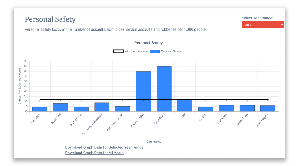
- For graphs displaying data by community area, you can toggle by year using the Select Year Range dropdown.
- If you’d like to adjust which variable is displayed in a graph, simply toggle data sets on and off by clicking a variable in the graph’s legend.

Personal Safety Indicator
All indicators provide the option to download the data as a CSV file, which can be opened in Microsoft Excel or Google Sheets. To download, simply click either of the following options available below a graph:
- Download Graph Data for Selected Year Range (available for some indicators)
- Download Graph Data for All Years (available for all indicators)
Never Fall Behind on Local Data
Before you navigate the 55+ indicators available on our site, please take a moment to subscribe to our email newsletter for future updates to our community indicators. Subscribe here.

